This article is a part of my assignment at the university. In the article, I present a simple way to tackle a data visualization problem from scratch, when you are given a dataset and want to find some insights.
I use Public Tableau for demonstration.
Dataset: American Community Survey
The following process (from Fisher, Danyel, Meyer, Miriah: Making Data Visual: A Practical Guide to Using Visualization for Insight) is applied for every question:
- Refine the question into one or more tasks
- For each task:
- Identify the components of the task:
-
Objects: Things or events of the task.
-
Measures: Variables measured for the objects, it can be existing attributes or computed from the data.
-
Groupings (or partitions): Groups of data using some filters.
-
Actions: Specifiy what to do with data (compare,, identify, characterize).
-
- Look for ambiguous components (which are not directly addressable by the dataset).
- For each ambiguous component, define a proxy by creating a new question that address the component, return to step 1.
- If there is no ambiguous component, the task is actionable and can be addressed by visualization.
- Identify the components of the task:
Note: All the questions are only for analytics purpose. I have absolutely no bias for gender, races or social classes.
Question 1: Is it true that you will earn more if you are a white man?
-
Task: Define
high income=Annual income > 50k,low income=Annual income <= 50k, identify the number ofhigh incomeandlow-income-
Action: Identify
-
Object: people and their
Annual income -
Measure: number of
high-incomeandlow-income -
Grouping: Filter people with
high-incomeandlow-income
-
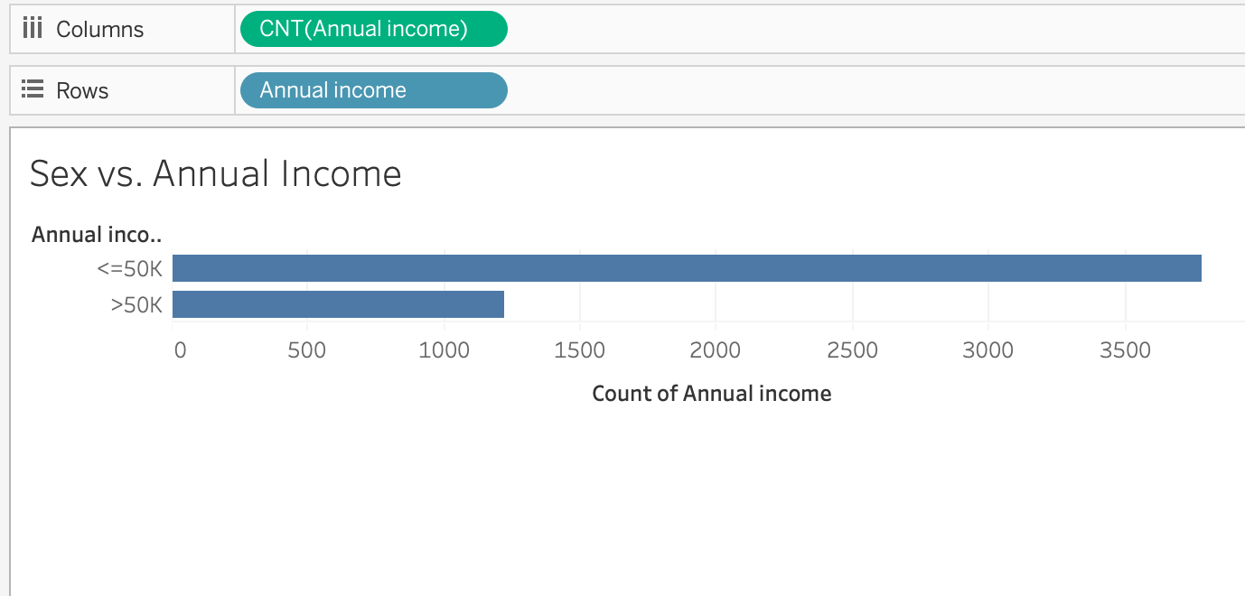
The number of high-income (1221) is 3 times less than the number of low-income (3778).
-
Task: Identify the number of males and females
-
Action: Identify
-
Object: people and their
Sex -
Measure: number of
maleandfemaleinSex -
Grouping: Filter people with
Sex maleandSex female
-
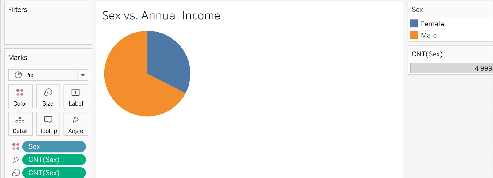
The number of male (3371) doubles the number of female (1628)
-
Task: Identify the number of
maleandfemalefor each category ofAnnual income:-
Action: Identify
-
Object: people
-
Measure: Number of
maleandfemaleinSexfor each category ofAnnual income(high-incomeandlow-income) -
Grouping: Filter
maleandfemale
-
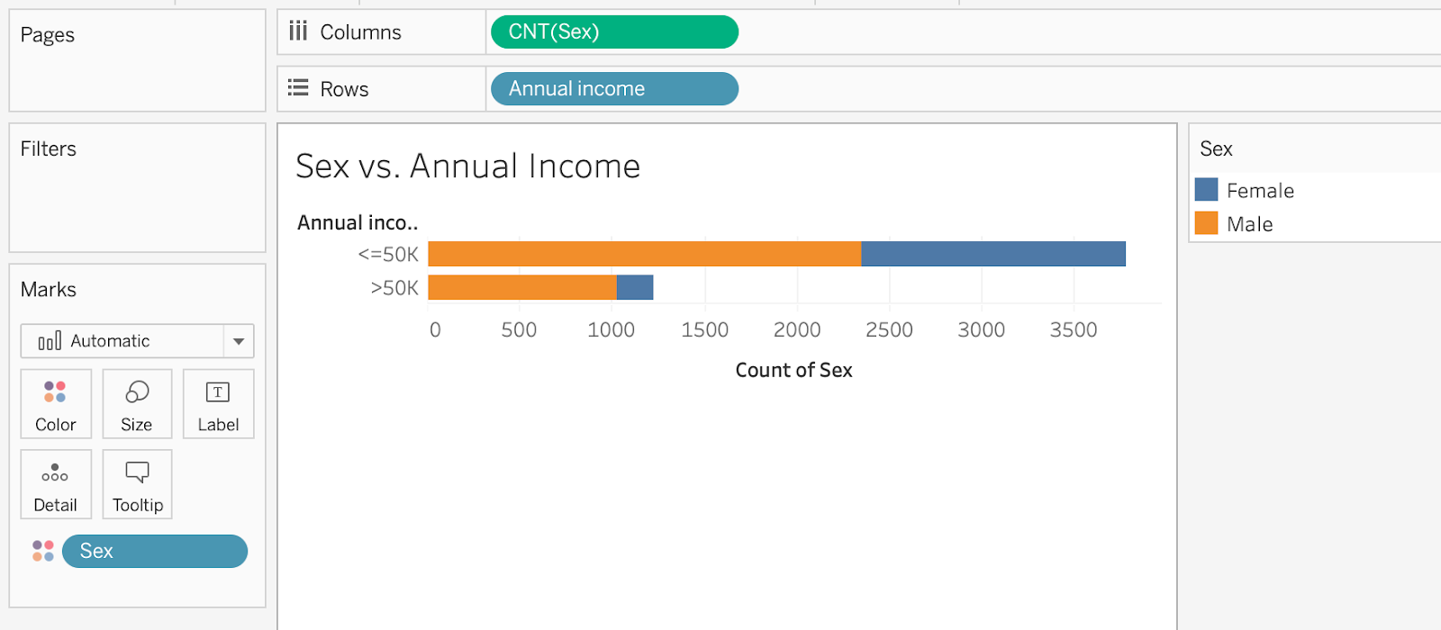
male accounts for 83.92% (1025 / 1221) of people with high-income. One part of the question can be answered here. You are more likely to earn more money if you are a man. However, since the number of male doubles the number of female and the number of low-income triples the number of high-income in the dataset, this conclusion is not concrete.
-
Task: Identify the number of people for 2 groups of race (
Whiteand the rest) according to each category ofAnnual income:high-incomeandlow-income-
Action: Identify
-
Object: People
-
Measure: Number of 2 race group
Whiteand the rest (Amer-Indian-Eskimo,Asian-Pac-Islander,Black,Other) for each category ofAnnual income(<= 50kand> 50k) -
Grouping: Filter
RaceandAnnual incomegroup
-
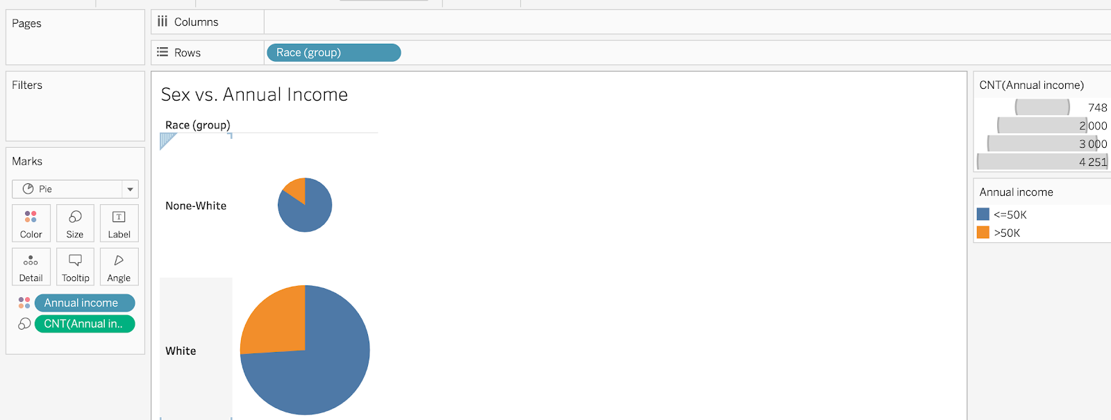
The number of White is 4 times more than the number of None-White. However, the percentage of high-income in White is much higher than in None-White (25.99% and 15.51% respectively).
In conclusion, according to the calculation from the dataset, if you are a white man, you will have a high chance of making more money.
Question 2: What are the impact of age and level of education on annual income?
Task: Identify the number of old, middle-age and young people:
-
Action: Identify
-
Object: people and their
Age -
Measure: Number of people for each
Agerange -
Grouping: Filter
Ageforold (Age > 60),middle-age (30 < Age <= 60)andyoung (age <= 30)
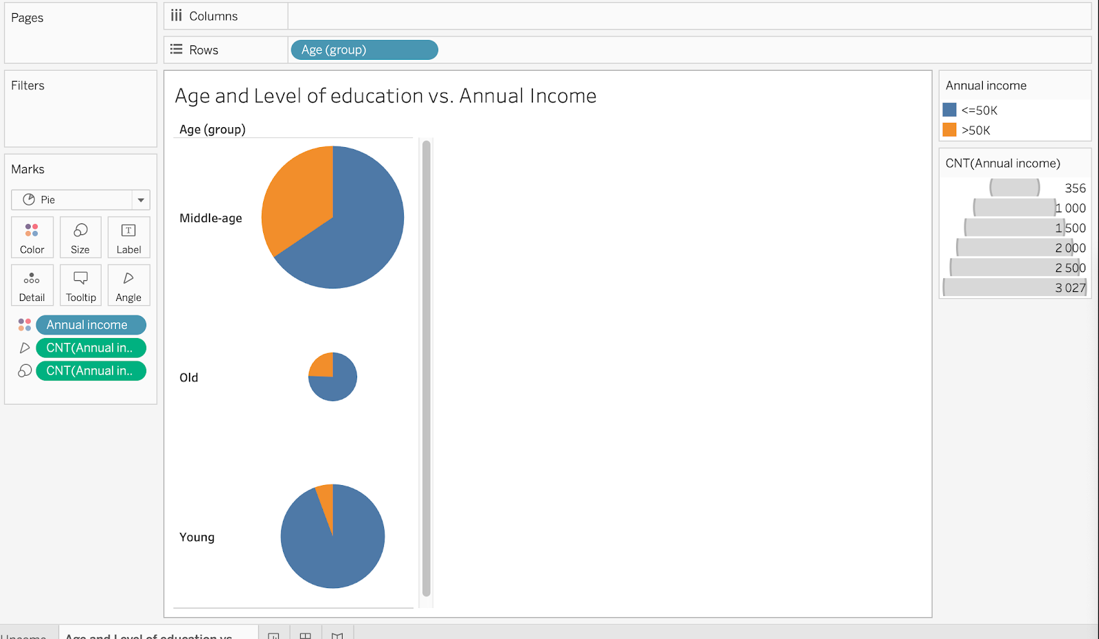
middle-age has the highest percentage of high-income comparing to old and young.
Task: Identify the number of people in each level of education:
-
Action: Identify
-
Object: people and their
Level of education -
Measure: Number of people in each
Level of education -
Grouping: Filter
Level of education
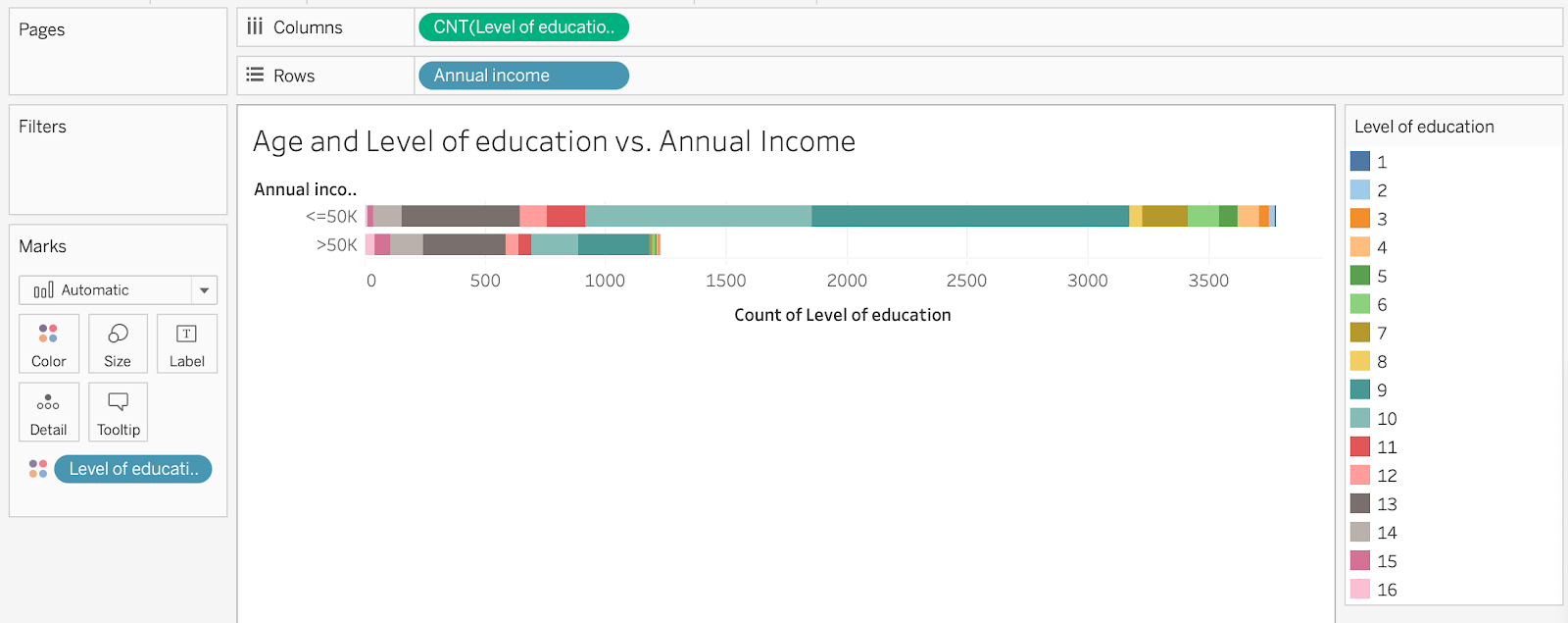
Since this visualization seems too complicated and the Levels of education which has the highest number of people are 9 and 10 (high-school graduation and some-college respectively), I divide Level of education into 2 groups: college-level (Level of education >= 10) and none-college-level (Level of education < 10)
Task: Identify the number of people in 2 groups of Level of education
-
Action: Identify
-
Object: people and their
Level of education -
Measure: Number of people in each
Level of education -
Grouping: Filter in 2 groups of
Level of education(college-levelandnone-college-level)
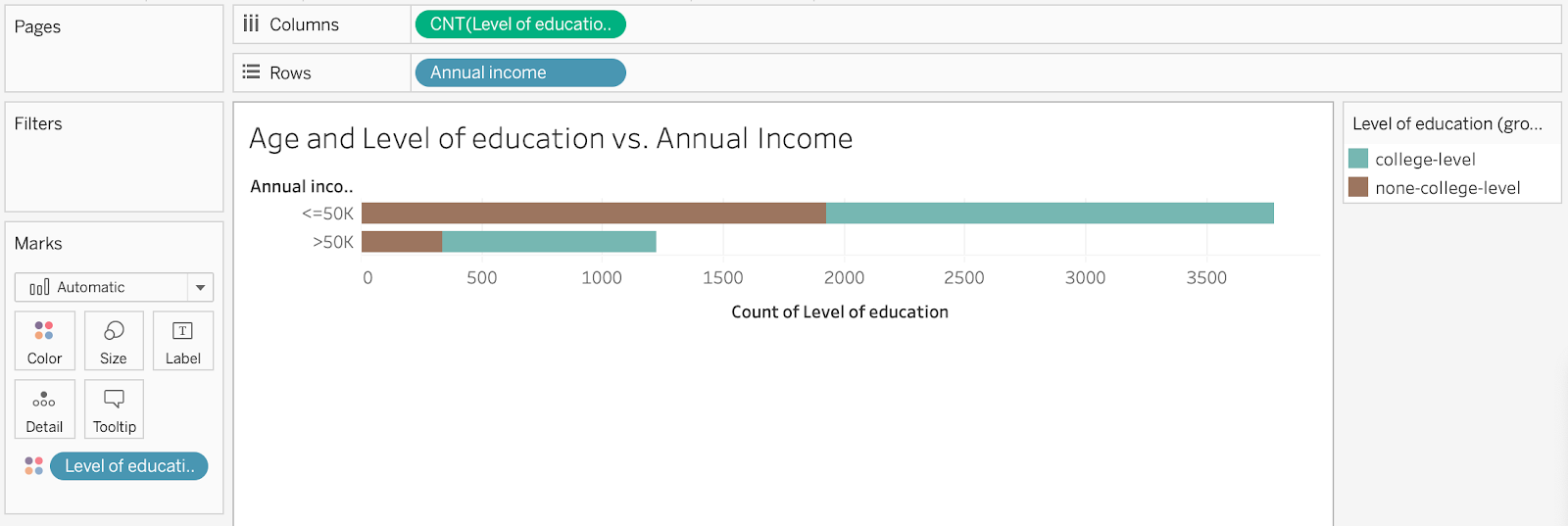
It is easier to visualize now. For low-income, the percentage of college-level and none-college-level are almost equal. However, college-level people accounts for a percentage of people in the high-income group.
Task: Show the relation between Age and Level of education with Annual income:
-
Action: Show
-
Object: people and their
Age,Level of educationandAnnual income -
Measure:
Age,Level of educationandAnnual income -
Grouping: Filter in 6 groups in combination of 2 categories:
Age(old,middle-age,young) andLevel of education(college-levelandnone-college-level)
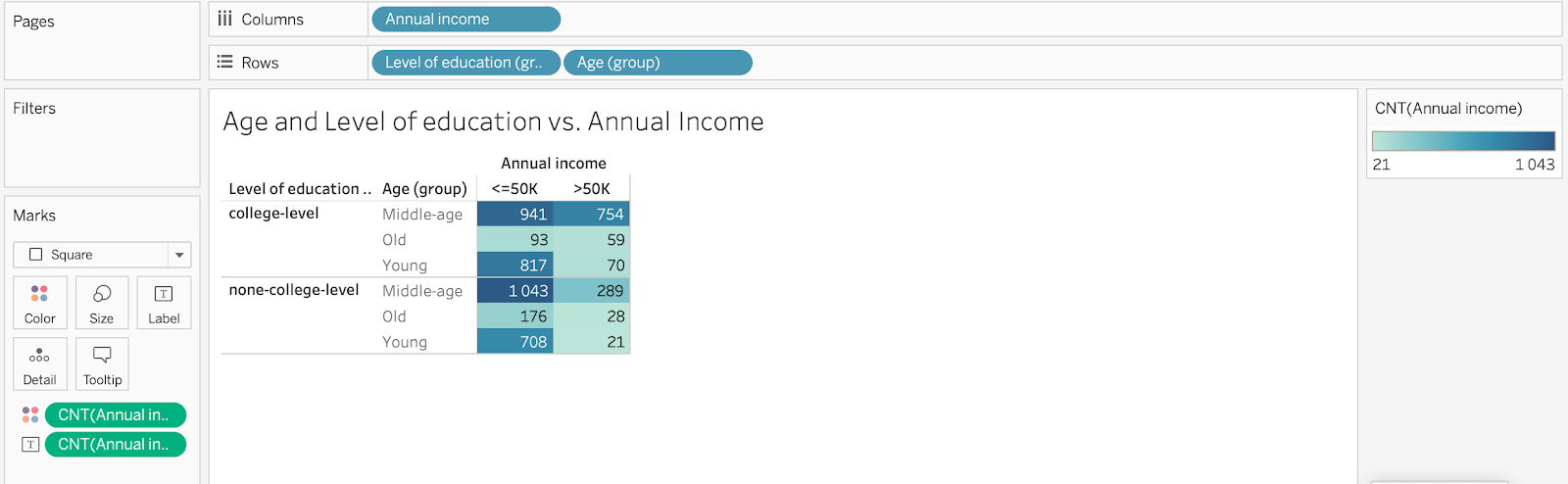
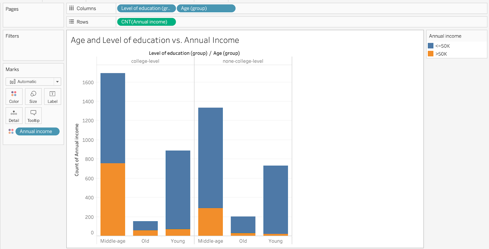
In the high-income group, college-level middle-age people contribute the highest percentage and outperform these other age groups.
In conclusion, Age and Level of education has impact on Annual income. You are likely to earn more if you are a middle-age person with a college background.
Question 3: Do people tend to be divorced or single if they work more than normal people?
Task: Define normal people’s work hours per week
-
Action: Define
-
Object: people and their
Work hours per week -
Measure: Average and mean of all people’s
Work hours per week -
Grouping: None
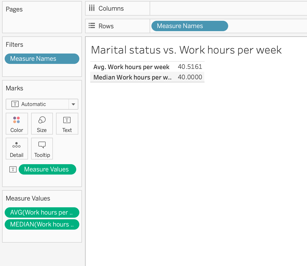
Therefore, normal people usually work 40 hours per week.
Task: Identify the average work hours per week of single people and the rest
-
Action: Identify
-
Object: People and their
Work hours per week -
Measure: Average of all people’s
Work hours per week -
Grouping: Divide into
single(Divorced,Never-married,SeparatedandWindowed) andmarried(Married civillian spouse,Married spouse in armed forces,Married-spouse-absent)
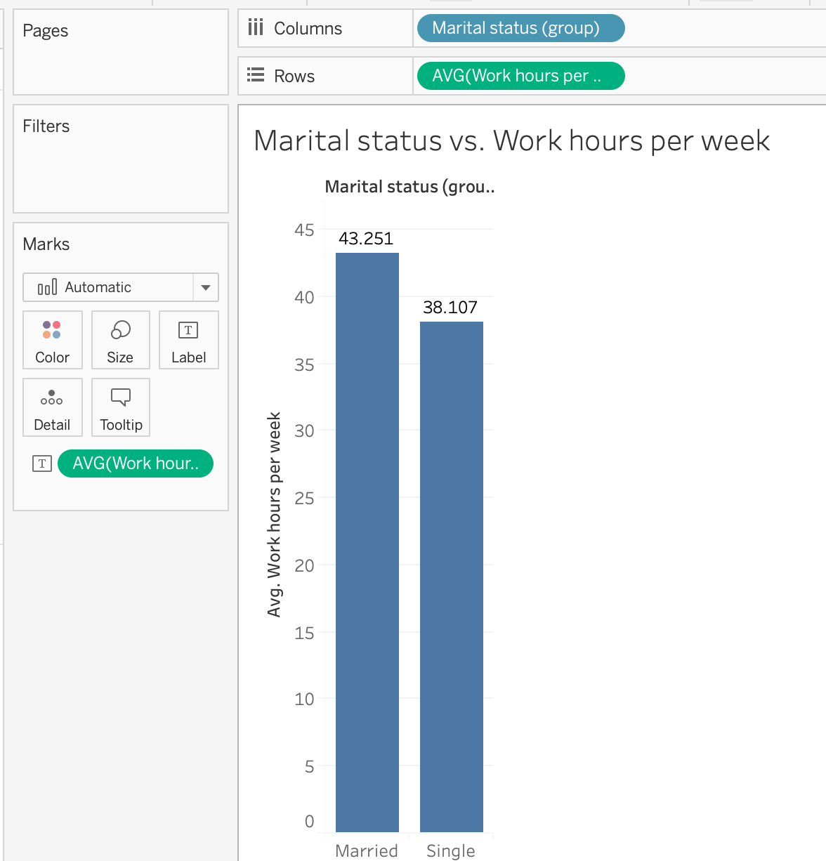
It turns out married people work more than single people. Let’s dissect the group using Relationship.
Task: Identify the average work hours per week of single people and the rest/
-
Action: Identify
-
Object: People and their
Work hours per week -
Measure: Average of all people’s
Work hours per week -
Grouping: Divide into
single(Divorced,Never-married,SeparatedandWindowed) andmarried(Married civillian spouse,Married spouse in armed forces,Married-spouse-absent)
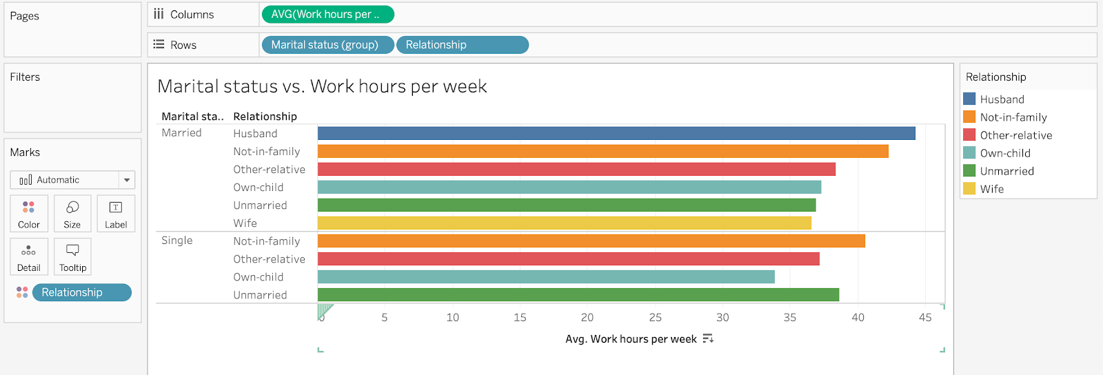
It is clear now that Husband and Not-in-family people in Married group work the most (that is reasonable since they have to support their children or their family). Own-child in Single group works the least.
Therefore, to answer the question, people don’t work more if they are single.
Question 4: Do people from outside the USA have to work more but earn less than people from the USA?
Task: Display the average work hours per week and the annual income of people from outside the USA and people from the USA
-
Action: Display
-
Object: People
-
Measure: Average of all people’s
Work hours per weekandHigh income(new variable created usingIF [Annual income] = '>50K' THEN 1 ELSE 0 END) withNative country -
Grouping: Divide into
USA(Native country = United-States) andnone-USA(Native country != United-States)
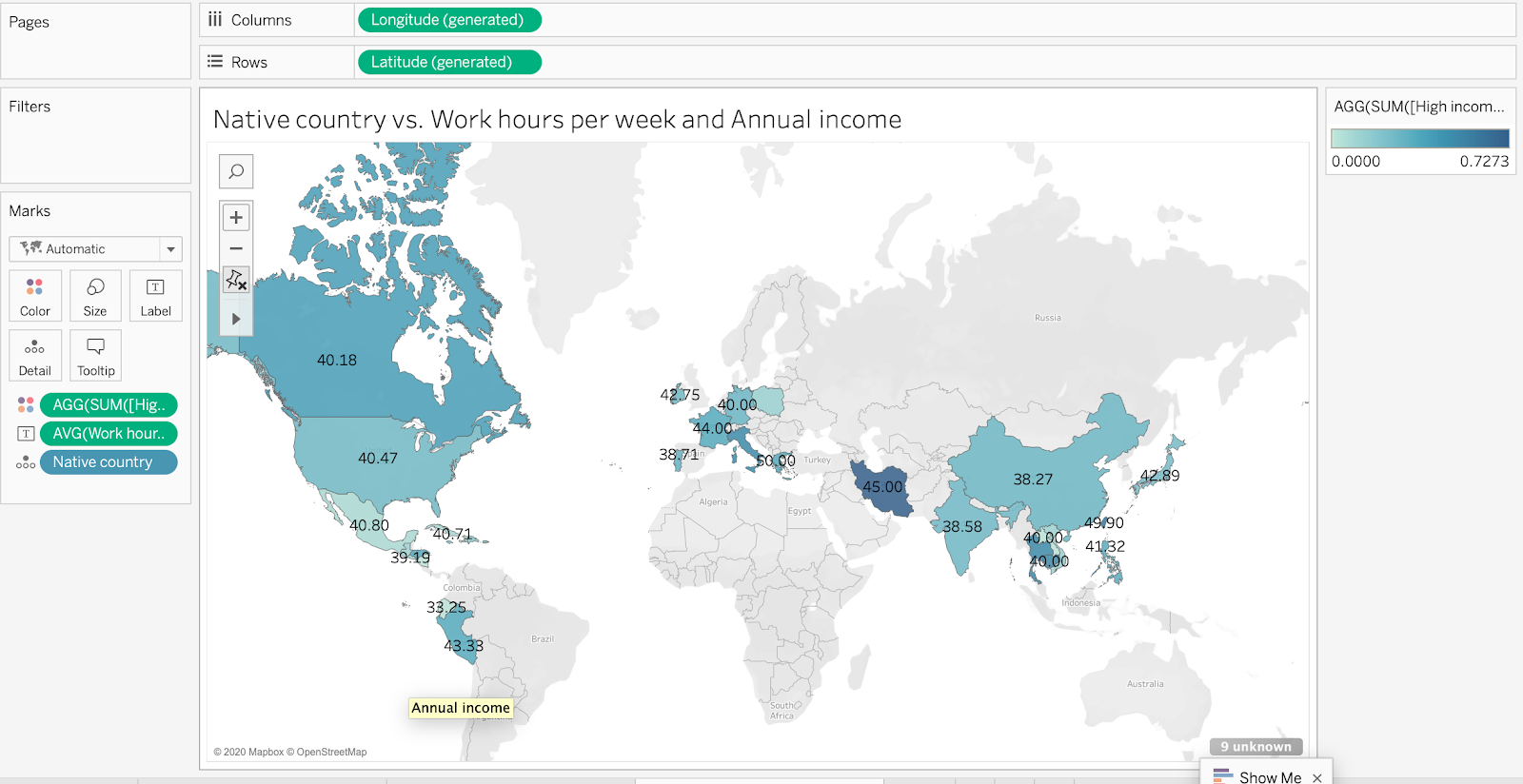
The numbers in the map show the average work hour for each country and the color shows the percentage of high-income. The average work hour for every country is nearly the same (about 40 hours per week) except Thailand (~ 80 hours per week but this number is biased because there is only 1 person from Thailand in the dataset). Iran has the highest percentage of high-income (3 samples in the dataset) but there are no significant differences between other countries.
In conclusion, people from all over the work work the same amount of time per week and there is no evidence from the dataset that shows people from outside the USA have to work more but earn less than people from the USA.